NOTE: This blog has been moved to http://www.looksgoodworkswell.com

Friday, April 09, 2010

Inline Form Validation

At the last Web App Masters Tour Luke Wroblewski gave a great talk on Forms in Action (quick plug -- you can hear him again in Minneapolis, Philadelphia or Seattle as the tour continues in those cities as well as myself and others!)
Luke brought out that on the good side more forms have added interactivity to form field validation. Error prevention is an important design principle. An ounce of error prevention is worth a pound of error handling design and code.

But on the bad side some forms are actually hurting the experience by either being too aggressive or trying to be too clever in input assistance.

I stumbled across two examples to add to Luke's collection. Both come from a very useful tool Its Deductible. I highly recommend the tool for what it does as it encourages me to donate more items and allows me to accurately take them off my taxes each year. Big fan. But two not so good experiences in their forms.

Not Clearing Error Message

It's Deductible: Error Message not Cleared
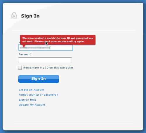
Its Deductible Error Message on Login Screen

I entered the wrong account name and got a message bubble warning me about it. Good things about it:
  • The bubble is clearly worded.
  • Red color got my attention.
  • Is nicely placed
However, the screenshot above is after I started typing a new login name. Even after I tabbed into the password field the error message stayed up. What's bad about this? I got immediate feedback that something went wrong. But got no credit for trying to fix it. Once I started typing the new login name the bubble should have disappeared.

Draconian Date Input Handling

How many times have I entered a date in a web form? So I just need to know are you expecting month/day/year format and whether I should type the slashes or not. However watch the video and see how poorly I entered the date!

Its Deductible Date Input Handling
Don't even think about entering slashes or not giving 2 digits for the month, 2 digits for the day and 4 for the year. Anything except typing 02092009 will fail.

Here is what went wrong.
  • You have to enter 2 digits for the month, 2 digits for the day and four digits for the year. Why? Next bullet point...
  • You can't enter 'slashes'. If you do you get two slashes! And when you submit it won't like that.

It is obvious there was some effort put into assisting me in entering a date correctly. But unfortunately it took me about 45 seconds to figure out their algorithm and enter the date in exactly the way they wanted me too.

BTW, You can use SCOTT for a 10% discount on the talks in Minneapolis.

Thursday, April 08, 2010

Designing with Lenses - Slides - CHIFOO 4/7/2010

Had a great time last night presenting at CHIFOO in Portland. Lovely facility at the White Stag Block, University of Oregon. Thanks Leo Frishberg for the wonderful hospitality. This was the first time I have given a talk on design lenses so was curious how it would be received. I was really happy with the positive feedback.

Here are the slides from last night.


The biggest takeaways for me were:
  • The idea of lenses is a great way to mentally frame design principles
  • There is a strong interest in us curating these principles
  • There is still some tinkering on how broad the lenses should be (lumping vs. splitting). The analogy of a camera lens was used by Ann Marcus. Narrow the lens and get the details but lose more of the context. Widen and you get less detail but a broader application.
  • That lenses can serve (as patterns do) to inform not just designers but all involved in product design as a common vocabulary and repository for examples.
Let me know what you think.

You can follow the lens project on the @uxlenses twitter feed. Or visit the designingwithlenses.com site directly.

Tuesday, April 06, 2010

Speaking at CHIFOO on Design Lenses

Looking forward to a quick jaunt up to Portland tomorrow and back home again Thursday morning. This is my week between Netflix and Meebo and it has actually shaped up to be quite busy. But I am excited to be giving a new talk on Lenses.

Since the CHIFOO site seems to be down at the moment, here are the details of the talk:

Designing with Lenses: Lessons from Other Design Crafts.

In any field of design, designers can enhance their craft by studying the work of others. Through the careful exercise of breaking down real-world solutions into their underlying principles and patterns, previous lessons can be applied to new sets of problems we encounter. Designing for web interfaces is no different. By necessity we are constantly searching for inspiration and practical guidance in solving the problems we face as designers each day. A powerful approach is to capture these lessons into "design lenses". A design lens allows you to view the user experience through the eyes of a single design principle. Lenses were originally created for game design but are just as powerful for user experience design.

In this talk, I will introduce the idea of design lenses and discuss several lens inspired from fields of study as diverse as theater, magic, game design, storytelling, Shaker furniture, motion graphics, and comics for inspiration in designing rich, interactive interfaces. By teasing out some of the key takeaways from each of these disciplines, a fresh light can be shed on our own corner of the design universe.


Join us at 7pm at the University of Oregon's White Stag Block.

UX Booth Article on Design Lenses

A design lens allows you to view your user experience design from the perspective of a single design principle. Lenses were originally created for game design but are just as powerful for user experience design.

I recently started documenting lenses that I find useful on a new site Designing with Lenses. Though it only has 3 lenses to start with, more lenses are coming in the months ahead.

To get the whole scoop, go read the introductory article Designing with Lenses over on UX Booth.

This article is part of a series of posts written by the speakers of UX Lx, The premier UX conference in Lisbon, Portugal; happening on May 12th–14th. There's a great lineup of speakers and Portugal is absolutely beautiful, so head over to the conference site. You can enter UXBOOTH2010 for a 10% discount.

To get updates on new lenses follow my uxlenses twitter feed here.

I will also be talking on this subject at CHIFOO in Portland tomorrow night (April 7 at 7pm). Join me if you can!

Friday, April 02, 2010

Animation Rules! Notes from Talk - Chet Haase & Romain Guy

I met Chet at the 360|Flex conference. We were on a panel together and talked about the UX of animation. Chet works on the Flex SDK especially focused on the animation/transition parts of the toolkit. Romain works on the UI toolkit for Android (including animation)

He & Romain spent some time last year studying the excellent book The Illusion of Life about Disney Animation by a couple of the masters of animation. The book discusses 12 rules of animation. They extracted a few principles from the book that apply directly to animating user experiences and shared them in the talk Animation Rules! they gave last year at Devoxx in Belgium.

They also mention Timing for Animation, another book I have on my shelf.

Some of the takeaways from the rules of animation:
  • Squash & Stretch. Lifelike objects deform in reaction to gravity & collision
  • Anticipation. Short actions just before the main one. Give hints to the user about what will or may happen.
  • Staging. Clearly communicate to the audience what is happening (poses, camera views, lighting, focus). Emphasize the important elements. Avoid too much noise.
  • Follow through, overlapping action. Realistic body physics. We are not rigid bodies.
  • Using Slow in & out.
  • Using Arcs in motion.
  • Secondary actions. Actions which emphasize or complement the main.
  • Timing. Careful timing of actions for realism, impact & effect.
  • Exaggeration. Making actions more lively, more obvious, more entertaining.
  • Solid drawing. Drawing has to be solid before you can animate well.
  • Appeal. Believable, appealing characters that the audience can enjoy.
Chet & Romain's Proposed Rules for GUI Animation:
  • Timed: Fast, realistic & appropriate
  • Designed: Use animations for good, not evil
  • Smooth: Don't make your users hate animations
  • Transitioning: Bring the users along
  • Realistic: Motion, timing, interactions.
  • Anticipatory: Hint what may happen
  • Simple: Help the user, don't confuse them.
This is just a summary. So make sure you watch the talk at Chet's blog.