NOTE: This blog has been moved to http://www.looksgoodworkswell.com

Thursday, November 20, 2008

Update: Designing Web Interfaces Book Available for Pre-Order

In an earlier post I mentioned our upcoming O'Reilly book, Designing Web Interfaces that I coauthored with Theresa Neil. The good news is we are getting very close to publish date -- December 2008 or January 2009. It is now live on Amazon and available for pre-order.

You can read about the contents of the book here and here.

The book is a partial outgrowth of various talks I have given over the last few years: Designing for Ajax, Designing Web Interfaces: Principles and Patterns for Rich Interaction and When Designers Get Too Clever: Anti-Patterns.

(By the way, the bird on the cover is the Guianan Cock-of-the-Rock and the image is from Johnson's Natural History. Yeah, I feel like strutting ;-)


The work on the Yahoo! Design Pattern Library also helped frame of lot of the ideas presented in the book (there are 75+ patterns discussed).

Additionally the work that Theresa & I did at Sabre Airline Solutions in documenting design patterns, performing heuristic evaluations on two dozen complex airline products as well as actively designing new solutions for the suite of products brought a lot of the principles to light while writing this book.

Two other items I am very excited about.

Companion Flickr Site
First, following the example of Luke Wroblewski (who also wrote the Forward to the book) we will be making all of the figures and illustrations (over 500 images) available on the companion Flickr site. In addition since many of the images are keyframes that illustrate steps in an interaction, I will be making the original screencast movie available on the flickr site as well. You can see an example of this for All the Web's Live Search (Yahoo! experiment that is no longer available). Like Luke, we will make all this material available via Creative Commons. You will be free to use it in your presentations, etc. We only require attribution back to our book.

Companion Book Site
Additionally, Theresa & I will be posting and keeping up to date a companion book site, DesigningWebInterfaces. We will be posting new examples, new patterns, new anti-patterns as well as links to other great pattern sites or books. Note, that it is just a "parked" page at the moment. Look for the site to be live around the book publish date. Stay tuned here for the go-live announcement.


Tuesday, October 28, 2008

Sr. Web UI Engineer for Customer Service Engineering

** Update: Position Filled! **

We recently filled the position I posted earlier.

I now have a new position to fill -- Sr. Web UI Engineer for Customer Service Engineering. In this role you will help design and engineer a new suite of web-based customer service applications.

In the previous role it was challenging to find someone with the right mix of semantic markup skills, javascript prowess, css wizardry, and java/jsp experience. In this role the requirement to be a DHTML god is lessened. What I need is someone who:
  • Is passionate about designing and engineering great interfaces
  • Has solid experience designing & building enterprise web applications in a Web 2.0 manner (rich in features, more complex in interaction than our main Netflix site)
  • Has strong proficiency in server-side UI technologies (Java, JSP, Struts, Tiles)
  • Has a solid background in simple software architecture and design as well as can communicate their solutions to the rest of the engineering team
Your job profile will probably include a good deal of experience with building user interfaces for non-consumer oriented sites.

If you have always wanted to work for a site like Netflix, but were unsure you had enough consumer web site experience then this could be a great opportunity. The applications you will design and build are not for the main Netflix member site, but instead for our #1 rated customer service team.

The person in this role will be part of the Customer Services Engineering Team as well as a member of my Netflix Web UI Engineering team. Since much of the work is greenfield you will have the opportunity to help design the user experience as well as build the web applications. In addition, the Netflix UI framework that the site runs on is shared with these applications. As such you will help flesh out this framework as we go forward.

So what technologies would you be using?
  • HTML, CSS
  • JavaScript
  • Java
  • JSP
  • JSP Tags
  • Struts2
  • Tiles2
  • YUI Grid
  • jQuery
For more details, check out the official job posting. Also, feel free to contact me directly at b DOT scott AT yahoo DOT com.

Here is the LinkedIn Posting.

Tuesday, October 21, 2008

Designing Web Interaces Talk (Ajax World)

Slides from Ajax World talk:

Designing Web Interfaces
View SlideShare presentation or Upload your own. (tags: design web)

Update: Yahoo! Account Fixed or "The Awful Face of Customer Service"

As noted before I was having trouble with my Y! id. My alias account (that I give out most frequently) no longer worked.

As I mentioned my experience with emailing Yahoo! was really bad. Canned messages saying the same thing no matter what I wrote -- the only difference was the signature at the end.

Phone calls weren't any more helpful. After searching and finding the phone number, I called to explain the situation. It seemed we had reached the point where she finally got my dilemma. However just at that point of epiphany the phone went dead. Somehow we were disconnected. So I called again. Finally reached that point again and she promised me a response in 3-5 business days. Yea, right. That was 2 weeks ago and nada :-(

Fortunately I used to work at Yahoo! I still know lots of people internally so in parallel I sent them a note about my problem (as well as many emailed me when they saw my blog post). Once I got in contact with one of the leads on Y! Mail they got the ball rolling internally. Somehow my alias account got corrupted. It was now a "child" account (you can create parent/child accounts for minors) and could not be accessed. It took a little over a week but finally it got fixed. Very thankful to the hard work of some of the folks in the Mail/UDB/Member teams that resolved the issue.

This got me thinking though. What if I had not worked at Yahoo! before? Well this account I guess would just be dead and I would have lost that email address. I really don't see any other outcome.

It also got me thinking about the various faces of any company. If my only experience had been email then I would have felt that Yahoo! was uncaring and faceless. If my only experience had been the phone I would have heard a sympathetic voice but no follow through. But I happen to know that once the problem came to the attention of people inside Yahoo! they jumped on it and worked extra hours & the weekend to resolve the problem.

This is always the problem with anytime we have a problem with a company. It does not matter if the engineers inside the company are caring, dedicated people. The customer service organization is the face to our users. Unlike in most cases, I also had the unique perspective to know that the number of user accounts created on a daily basis is staggering. And the level of calls/contacts to customer support is huge.

I guess if I did not have the inside view I might have fallen prey to conspiracy theories -- seems that when people have a problem with a company it becomes personal or the screw up is really a way for the company to squash the little guy.

But it was not. Nor is it hardly ever that way. It was just an odd, rare bug that just happened to clobber my account that was not easy to detect and not simple to fix right away. And if the right people get it brought to their attention they work hard to resolve it.

Tuesday, October 14, 2008

YUI Carousel Component (2.6.0)

On October 1, 2008 Yahoo! announced the release of YUI 2.6.0. This
release contained the official YUI Carousel component.

As you know, the intent of my carousel component was to fill in a gap in the YUI library. In 2006, I created the ycarousel component. Thankfully, many people have found it useful over the last 2 years.

Before I left Yahoo! in 2007, I spent some time with the YUI team,
discussed the ideas behind the way I approached my component, what I
liked about it and more importantly what I did not like about it :-)

The newly released YUI component shares some of the same
properties/api with my component but has been written from the ground
up. So I am excited about their
new carousel and encourage everyone to migrate to it instead of using
the carousel shown at this site.

The fact is you will get better support for their component. I am just
too busy with other projects to really support it the way I would like
and there is just no reason to cloud the space with two components
(even named similarly ;-)

You can find the new YUI Carousel component at the YUI library site.

The latest version of my carousel can be found at my site.

Monday, October 13, 2008

Ajax World Interview: Bringing Excellence to the Field of UI Engineering

Jeremy Geelan over at Sys-Con interviewed me about the field of user interface design & engineering.


I will also be presenting at the Ajax World conference in San Jose, CA on Crafting Rich Web Interfaces

The talk is based on my upcoming O'Reilly book Designing Web Interfaces (co-authored with Theresa Neil). The session happens on Monday, Oct. 20th @ 4:30pm.


Wednesday, October 08, 2008

Yahoo! Front End Developer's Summit 2008 - Talk

I had the wonderful privilege of giving a keynote today at Yahoo!'s Frontend Summit. Douglas Crockford gives the one for tomorrow.

I took a stroll down memory lane talking about everything from slide rules to Wang Desktop Programmable Calculators to programming on the Macintosh 128k. In many ways this played off an earlier blog "All I reall need to know I learned from a Mac 128k".

Here are the slides:
Back To The Future
View SlideShare presentation or Upload your own. (tags: yahoo keynote)


A video will be available at the YUI Theatre later this month. I will post a link here when that happens.

Friday, October 03, 2008

Update: 3 year old server error... Yahoo! says is definitely the problem with my account!

Man, I was never on this side of Yahoo!'s customer service before. But it sure does hurt.

After getting the previous response I patiently explained that it was not possible for a server error to be the culprit since the account in question is 3 years old. 

Yet, Yahoo! customer care responded to this sensible explanation with exactly the same answer (only this time from 'Nick')

Hello Bill,

Thank you for writing to Yahoo! Account Services.

We sincerely apologize for any inconvenience this may cause you. It
appears that there may have been a server error at the time you
registered for your Yahoo! account. Unfortunately your information was
not correctly saved, and you will be unable to access this account. You
are welcome to create a new Yahoo! account with a different ID. Again,
we apologize for any inconvenience.

Thank you again for contacting Yahoo! Account Services.

Regards,

Nick

New and Improved Yahoo! Mail - better than ever!

Argh! But hey, I am free to create a new account! Yipee! That sounds like fun. Why didn't I think of that before?


Thursday, October 02, 2008

Three Year Old Server Error Haunts My Yahoo! Account :-D

Gotta love this.

I have an email account that I have had for about 10 years. While at Yahoo! I jumped on the opportunity to create an alias (also known as a profile). When they allowed the 'period' character to be used in an email account I created b <dot> with my last name.

As of this morning this is broken. While Y! IM understands I still have this profile, I can't login to it anymore, can't receive email, can't use IM with that profile, etc.

So if you are trying to reach me via the B <dot> email then forget about till I get this mess straightened out with Yahoo! Here was the first response:

"We sincerely apologize for any inconvenience this may cause you. It appears that there may have been a server error at the time you registered for your Yahoo! account. Unfortunately your information was not correctly saved, and you will be unable to access this account. You are welcome to create a new Yahoo! account with a different ID. Again, we apologize for any inconvenience.
"


Right. You are telling me that there was a server error three years ago that just now showed up? Sounds like a canned answer.

I finally found the contact number for Yahoo! Customer Care. For anyone interested it is: 1-866-562-7219. After getting my call cut off (after painfully explaining the situation) I got another customer care person. They have escalated it -- they should get back to me in 3 - 5 business days.

Sigh.

Ironically, I give a keynote at Yahoo!'s Front End Summit next week.

Wednesday, October 01, 2008

Netflix Public API Available

I am proud to say that Netflix has just released its public APIs.

The API allows access to data for the catalog of 100,000 movie and TV episode titles. This includes DVD titles as as well as instant watch titles. Applications can request access to a member's account (via OAuth) for working with their queue as well as other movie related account information.

Best of all it's free. We allow commercial use (e.g., a developer can create an iPhone app and sell it for a buck -- that's ok).

I gave a lightning talk about this at the Ajax Experience yesterday in Boston. It both quickly covers the API as well as our first Netflix Hack Day where we exercised the APIs in a 24 hour coding frenzy. I will upload this to slideshare when I get a decent internet connection (why can't these new beautiful hotels have decent internet connectivity?)


Developers can get access by signing up at http://developer.netflix.com.

BTW, there is also a great step-by-step tutorial from Joseph Smarr (he is the platform architect for Plaxo)

Happy Hacking!

Tuesday, August 12, 2008

Still Hiring

My new T-Shirt from Zazzle.


Interested?

Wednesday, July 16, 2008

New Job Opportunities

Netflix - Sr. Web UI Engineer
I recently filled a position for Sr. Web UI Engineer that I blogged about before.

But hey, we are hiring again. The description is the basically the same as the last position. You can read all about it on the Netflix Jobs site or apply for the position on the LinkedIn posting.

And while we are on the subject of jobs let me mention a few other opportunities.

Netflix - Design Team Positions
Nancy Mott (design lead) has 4 openings on her team. Lots of new ideas brewing in the design team. Come be a part of this exciting team.
Slideshare Opportunity - Web Developer
And finally, my good friends Jonathan Boutelle & Rashmi Sinha have an immediate need at Slideshare (in SF). In the words of Jonathan:
Friends,

As many of you know, SlideShare has been growing like crazy lately! We closed a funding round two months ago and have opened up a snazzy new office in the SOMA neighborhood of SF.

I'm looking for a great web developer to join our merry band: someone who's good at straight-up app development and is fairly handy on the back-end as well. We're a Ruby and Python shop, but language is no bar if an engineer has what it takes otherwise. This job is located in either our San Francisco office or our New Delhi office.

Let me know if you or somebody you know is interested. We're offering a referral award of $1500 if you refer somebody we hire for this position.
You can contact Jonathan at jon AT slideshare DOT net.

Anti-Pattern: Animation Gone Wild - Borders.com

Borders.com just announced the new Borders.com

I ambled over curious if there were any new Ajax style interactions. And what did I find? A classic example of the anti-pattern Animation Gone Wild. This is when you employ gratuitous animation that adds no value either in communication or engagement.

Here is a screencast of it in action.


Instead of popping up the book, music, dvd information quickly we are required to watch the talent of the developer to sloooowly animate the box into place. Come on folks, we can do better than this!

There is no need to see utility objects like this animate into place.

Here is the general rule. Try your feature without animation. Is the meaning clear? If so then don't add ANY animation. If it is not, try adding a quick animation. Did that get it? Then stop there.

Save animation for when you need it. Animation is good for at least seven reasons:
  • Maintain context while changing views. Carousels are a good example of this. The scroll animation helps the user maintain context as they move through information.
  • Explain what just happened. The Apple store Customize your Mac uses this to highlight price changes while configuring a Mac for purchase.
  • Show relationships between objects. The Mac Genie effect when closing or opening windows. It is fast enough and it ties the iconified window to the dock.
  • Focus attention. Backpackit's Spotlight technique focuses attention on the change that happened.
  • Improve perceived performance. Progress Bars.
  • Create an illusion of virtual space. Yahoo! Home page's personal assistant (Tabs animate open).
  • Engagement. Mini-Cooper site, configure your car. The animation is fun.
BTW, I go into detail on animation in my upcoming O'Reilly Book, Designing Web Interfaces.

Upcoming O'Reilly Book - Designing Web Interfaces: Principles and Patterns for Rich Interactions

Update: Designing Web Interfaces: Principles and Patterns for Rich Interactions is now available on Amazon for pre-order. Planned release is December/January timeframe.


Since about February Theresa Neil & I have been actively writing a new book for O'Reilly.

This is part of a group of books O'Reilly is publishing around Design. Designing Interfaces is an excellent book on Design Patterns by Jenifer Tidwell. Designing Gestural Interfaces will be coming out soon by Dan Saffer. Jenifer's book did an amazing job of cataloging desktop and web design patterns. Dan's book focuses on all of the new and upcoming interactions around gesture based interfaces.

Designing Web Interfaces: Principles and Patterns for Rich Interactions focuses strictly on a set of six principles for designing Web applications to be highly interactive.

The six principles are:
  1. Make it Direct
  2. Keep it Lightweight
  3. Stay on the Page
  4. Provide an Invitation
  5. Use Transitions
  6. Be Reactive
The principles are illustrated by a series of design patterns called out in various chapters shown here in a table of contents.

Principle One: Make it Direct
  • Chapter 1. In Page Editing
  • Chapter 2. Drag and Drop
  • Chapter 3. Direct Selection
Principle Two: Keep it Lightweight
  • Chapter 4. In-Context Tools
Principle Three: Stay on the Page
  • Chapter 5. Overlays
  • Chapter 6. Inlays
  • Chapter 7. Virtual Pages
  • Chapter 8. Workflow
Principle Four: Provide an Invitation
  • Chapter 9. Static Invitations
  • Chapter 10. Interactive Invitations
Principle Five: Use Transitions
  • Chapter 11. Transition Patterns
  • Chapter 12. Purpose of Transitions
Principle Six: React Immediately
  • Chapter 13. Lookup
  • Chapter 14. Status
Appendix: Design Patterns

I have finished the first draft of the book and am now working my way back through the book. Hopefully it will start technical reviews in a couple of weeks. No definite word on when the book will be on the bookshelf -- but I will update as we nail down that date.

I am also setting up a companion site, http://designingwebinterfaces.com. Currently this is just parked with a generic placeholder.

Wednesday, June 25, 2008

Velocity Conference '08 Notes

Velocity Conference was great!

Takeaway
I think the greatest takeaway is how seriously the Firefox and IE8 team are taking client performance. In particular, the work of Steve Souders, the Yahoo! performance team, others who are writing about Ajax performance is the playlist for what to optimize. As Eric Lawrence of Microsoft said to Steve, "Our mission is to make your book on performance be out of date."

This is a very different picture from a few years back.

I still find it very disappointing that the Safari team is always absent at these discussions. I realize that Safari is kicking butt in performance (I will post examples from our round trip stats to show that) but it really is important that they are approachable by the community. But this seems to be the way of Apple unfortunately.

Some Great Talks
There were a lot of good talks, but here are the ones that stood out to me (I did miss both mornings).
Some Great Announcements/Tools
My talk is also available for download.

Already looking forward to Velocity '09.


Blogged with the Flock Browser

Sunday, June 22, 2008

Friday, June 20, 2008

Announcing: Jiffy Firebug Extension for Viewing Client Side Performance Data

In the previous article I discussed our full cycle tracing mechanism we built at Netflix.

Firebug Extension: First Attempt
When I was trying to explain the capabilities of this system to others in the organization, I started doodling in Apple Keynote to see if I could create a single diagram that captured all of the timings and what was really happening during a full cycle trace. This is where the diagram I used in the previous article came from. Here is the diagram:

roundtrip-blog-capture-alltimes.png (by billwscott)

This got me thinking. What if I could create a tool that would take the timings from the web page and render it with real time data. The obvious solution was to build this as a Firebug extension. Here is what the tool ended up looking like once it was plugged into Firebug:

roundtrip-firebug.png (by billwscott)

The nice thing about this visualization is that it clearly puts the timings in context. You can see the Response overlapping with the Page rendering (which is a good thing). You get a clear picture of how the measurements fit together.

Currently, this is not available outside of Netflix. There is some code cleanup, upgrade to FF3/Firebug 1.2 needed as well as it is tied to the type of metrics I described previously. If others think it is useful I will try to burn some cycles, make the data source more generic and get it out for public use.

Jiffy Firebug Extension

However, I was showing this to Steve Souders (in relation to the Velocity panel) and he mentioned that one of the other panel members, Scott Ruthfield of Whitepages.com and his team were building an open source metrics and instrumentation tool for Web pages called Jiffy.

In the words of Scott:
Thus we built Jiffy—an end-to-end system for instrumenting your web pages, capturing client-side timings for any event that you determine, and storing and reporting on those timings. You run Jiffy yourself, so you aren’t dependent on the performance characteristics, inflexibility, or costs of third-party hosted services.
Steve suggested adapting what I had done with the current Neflix Firebug extension for use with Jiffy.

I quickly realized that since the focus of Jiffy was for measuring on the client page (as well as a way to log measurements) that I needed a more generic way to view the data. I decided to model this new measurement panel slightly after the Firebug Net panel.

The result is the Jiffy Firebug Extension.

Jiffy Firebug Extension

Today I am making this extension available to the public under a simple Creative Commons License. Simply put, this adds a new panel to firebug that provides a nice way to view timing measures either in a collapsed or timeline view. It's also flexible. You can wire it to other libraries besides Jiffy if so desired.

You can learn all about the extension and read more about the Jiffy library at my Jiffy Extension site or go directly to the Jiffy-Web google group.

Blogged with the Flock Browser

Measuring User Experience Performance

One of the projects my team at Netflix is busy with is improving the end-user performance experience. Anyone that reads my blog regularly knows that I am a champion for great user experiences. Often the performance angle is not included in discussions of the user experience. But as we all know the best design can be crippled by sluggish execution, waiting a long time for a page to be fully interactive or feedback that does not come in a timely manner.

Timing "from Click to Done" - Full Cycle Experience

User performance experience focuses on what is the full cycle time from when the user requests a page or invokes an action till a new page is ready for interaction or the action has completed. Most sites have various ways of tracing parts of the performance puzzle. Often backend instrumentation is inserted to time backend services. But a lot of sites don't have a complete picture of just how much time is the user spending from the time they click it till the time they get it back (done).

To address this issue at Netflix, one of the first things I initiated after joining Netflix was the creation of full cycle tracers. Kim Trott (on my team) took the idea, ran with it, fleshed it out and turned it into reality.

The idea of tracing the full cycle time is to:
  • Capture the start time
  • Capture various points of interest
  • Capture the end time
  • Log the results

Capture the Start Time ("from Click")
To get a full cycle time we need to capture the point in time the user makes a request.

At Neflix we use the following stack of technologies: Java, JSP, Struts2, Tiles2, HTML, CSS and Javascript. Within the normal HTTP request/response cycle our requests are handled via Java servlets (eventually routing through to JSP for Web pages).

roundtrip-blog-capture-starttime.png (by billwscott)

Unload Event
The most logical place to measure the start of a request ("from Click") is on the originating page (see A in figure above). The straighforward approach is to add a timing capture to the unload event (or onbeforeunload). More than one technique exist for persisting this measurement, but the most common way is to write the timing information (like URL, user agent, start time, etc.) to a cookie.

However, there is a downside to this methodology. If the user navigates to your home page from elsewhere (e.g., from a google search), then there will be no "start time" captured since the unload event never happened on your site. So we need a more consistent "start time".

Start of Servlet Response
We address this by providing an alternate start time. We instrument a time capture at the very earliest point in the servlet that handles the request at the beginning of the response (see B in figure above). This guarantees that we will always have a start time. While it does miss the time it takes to handle the request, it ends up capturing the important part of the round trip time -- from response generation outward.

There are a number of ways to save this information so that it can be passed along through the response cycle to finally be logged. You can write out a server-side cookie. You can generate JSON objects that get embedded in the page. You could even pass along parameters in the URL (though this would not be desirable for a number of reasons). The point is you will need a way to persist the data until it gets out to the generated page for logging.

Note that the absolute time captured here is in server clock time and not client clock time. There is no guarantee these values will be in sync. We will discuss how we handle this later.

Capture Intereresting Points Along the Way
After capturing the start point there are a few other standard points of time we would like to capture.

roundtrip-blog-capture-tweentimes.png (by billwscott)

Two points of interest are captured on the servlet side:
  • When we begin generating the HTML for the page (C)
  • When we end generating the HTML for the page (E)
Two points of interest are captured on the client side:
  • When start rendering the HTML for the page (D)
  • When we end processing the HTML for the page (F)
C & E deal with page generation. D & F deal with page rendering.

In D, we emit a scriptlet immediately after emitting the <HEAD> tag that saves new Date()).getTime() into a Javascript object on the page.

In F, we emit a scriplet immediately after emitting the </BODY> tag that saves new Date()).getTime() into a Javascript object on the page.

When the page starts rendering the HEAD it will execute D and store the time stamp. When the BODY finishes rendering, it will execute F and store the time stamp.

Capture End Time ("to Done")
Once F is finished however, this does mean that the page is completely rendered. In parallel, the browser has been loading CSS, Javascript, requesting images and rendering the page. But the page is not ready for the user to interact with (typically) until the onload event is finished for the page (see G in diagram below).

roundtrip-blog-capture-endtime.png (by billwscott)

We attempt to insert our instrumentation as the very last item to be handled in the onload event for the page.
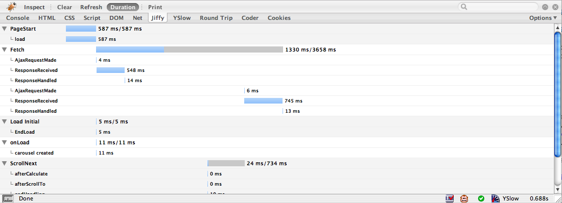
Logging the Captured Times
Here is a diagram that shows the various time points we capture (8) and the measures we derive (5).

roundtrip-blog-capture-alltimes.png (by billwscott)

The five measurements are:
  • Elapsed client request time (G-A). Full cycle time. The total time it took to request the page, receive the response and render the page. Not available if the referring page is not a Netflix page. This is not available for all measurements.
  • Elapsed server response (E-B). How much time was spent generating the server response.
  • Elapsed client render (G-D). How much time it took the client to render the page (and get the server response). Since we stream our response to the client, there's no way to differentiate how much of the client rendering time was spent getting the response from the server vs. rendering the page. The browser will start to render the page as it receives the content from the server.
  • Elapsed server plus client (C-B) + (G-D). Total time to render; full time to generate the response and render it client-side. This is the key measure we use as it includes the most reliable start time (that we can capture all the time). It is the summation of the client render time (G-D) and the elapsed server response (C-B). By taking the deltas on the client and the server separately we can safely add their values together to get a total time (even though they are captured in different server clock times). The caveat is there can be some gap between the time C emits the HEAD tag and the corresponding Javascript time stamp and the time D starts rendering. In practice we have found this time to be sufficiently small on the whole so have kept to this simple approach.
  • Elapsed  client render after body (G-F). This gives us an idea of how much additional time is needed to get the page fully loaded after rendering the body.
At this point we can gather up the five values (persisted so far via server-side and client-side cookies or some other methodology) and write these out to a server log. This could be done via an Ajax call, using beacons, an HTTP request with a NO-CONTENT response or some other mechanism. The back end service caches up results and writes them to a database for later analysis.

The Benefit of Measuring
We could have chosen to implement all the yslow performance suggestions without measuring anything. Most likely they would all be wins for us. But by putting a full user experience performance tracing mechanism in place we can be confident that enhancements, features, or even attempts at performance improvement did not negatively affect site performance.

Recently we fielded a different variation of our star ratings widget. While it cut the number of HTTP requests in half for large Queue pages (a good thing) it actually degraded performance. Having real time performance data let us narrow down on the culprit. This feedback loops is an excellent learning tool for performance. With our significant customer base, large number of daily page hits we can get a really reliable read on the performance our users are experiencing. As a side note, the median is the best way to summarize our measurements as it nicely takes care of the outliers (think of the widely varying bandwidths, different browser performance profiles that can all affect measurements.)

In future articles
  • Discuss what has worked and not worked.
  • Discuss an internal firebug extension I wrote to visualize this data for our developers.
  • Compare Safari vs Firefox vs IE -- the results are really interesting.
  • Announce a new Firebug Extension that helps visualize performance page data.
Hear More About this at the Velocity Conference
As I mentioned in my previous article I will be giving a 15 minute talk on Improving Netflix Performance at the Velocity Conference. I will cover some of this material as well as other information in that talk.

Credit
Thanks to my excellent UI Engineering team at Netflix, in particular the hard work of Kim Trott. Thanks also to the yslow team for giving us some concrete ideas on improving site performance.
Blogged with the Flock Browser

Velocity Conference 2008

My friend Steve Souders (Mr. yslow and author of High Performance Web Sites) is chairing the upcoming Velocity Conference in Burlingame, CA. It's happening on Mon-Tues, June 23-24.

I will be on the Measuring Performance panel with Steve Souders, Earnest Mueller (National Instrument), Ryan Breen (Gomez) and Scott Ruthfield (Whitepages). We'll be talking about what it means to measure performance for Web pages, why it is important, how to do it, various types of methods of measuring and the unique challenges around measuring Web 2.0 applications.

I will also be doing a quick talk in the afternoon on Improving Netflix Performance. The talk is only 15 minutes but I will be sharing our experience with implementing yslow, building a round trip tracer tool and some other cool stats & tools that we will be sharing. Look for a followup blog article on some of this information.

Hope to see you there.

Blogged with the Flock Browser

Thursday, May 15, 2008

Everything Good You Needed to Know About Javascript*

(*and even the bad parts)

At Yahoo! I had the privilege of working directly with Doug Crockford and got to review a book he was writing at the time, Javascript The Good Parts.

This book is different than most other Javascript books. It just focuses on the language itself and not the browser DOM. It reveals both gems and warts. And it does it in a simple straightforward manner. It reminds me of the classic The C Programming Language book that I cut my teeth on.

This is a must for your bookshelf.


You can get JavaScript: The Good Parts at Amazon.

Everything You Ever Wanted to Know About Forms*

(*but were afraid to ask)
My good friend and former Yahoo! colleague, Luke Wroblewski, has just published a most excellent book called Web Form Design.

Forms are everywhere. And when something is so ubiquitous, it tends to get absorbed into the back of our consciousness. Luke takes the lowly form and shines a spotlight on form usability. This book is full of best practices, tons of examples and lots of great insight from a dozen or so other leading web practitioners.

And hey. I can get you a 10% discount. Just go to Rosenfield Media and apply the code BSCOTT. Just enter it on the last page of checkout. You will save 10% and get a great book.

Wednesday, April 30, 2008

Omnigraffle Wireframe Stencil for the iPhone

Theresa Neil has recently been designing an iPhone application. In the process she created a wireframe stencil for OmniGraffle to make her life easier. Thought I would pass along.

OmniGraffle iPhone Wireframe Stencil

You can find the stencil at Graffletopia

Update: Now on her blog.

Tuesday, April 29, 2008

Netflix Jobs - Two Positions Open (4/29/08)

Update: Both positions have been filled.


Sr. Web UI Engineer


At Netflix I have an immediate opening on my team. This is an exciting opportunity to ply your amazing web development/engineering talents to one of the most recognized brands on the Web! In this position you would join an absolutely amazing team of Web UI engineers at an exciting time in Netflix history.

We are currently refactoring the entire Web UI layer. As a team member you would be responsible for specific areas of the site and participate in moving our site to latest Web standards (think unobtrusive javascript, layered semantic markup, hijax, etc.), working to improve client performance (think yslow and beyond) and working to realize lots of new approaches to our interface.

Over the last few months we also have been growing the design team and our team works very closely with both product management & design to create cutting edge solutions.

Here is the job
. Don't hesitate to contact me if you are interested. Email me at: b DOT scott _AT_ yahoo dot COM.

Sr. Software Engineer -- Open APIs
Michael Hart, our Director of Open APIs and Community is looking for an Open APIs Sr. Software Engineer. This is an incredible role. Netflix is in the midst of opening up a suite of developer APIs and you can help make this happen. Get in now and shape the way developers all over hack and mashup Netflix!

If you are interested drop me a note at the email I referenced above.

--
Bill

Wednesday, April 02, 2008

Anti-Pattern: Idiot Boxes - Yahoo! Photos

In Alan Cooper's About Face 3 book he states a simple principle:

Don't stop the proceedings with idiocy.

In the context of flow he describes the scenario:

One form of excise is so prevalent that it deserves special attention. In the previous chapter, we introduced the concept of flow, whereby a person enters a highly productive mental state by working in harmony with her tools. ... Interrupting a user's flow for no good reason is stopping the proceedings with idiocy and is one of the most disruptive forms of excise.

I call this the Idiot Box Anti-Pattern.

One of the clearest examples of this was with the Yahoo! Photos 3.0 product (which has been replaced by flickr).

yphotos-idiot-01.png

What follows are two idiot boxes. The first asks the user if they really meant to carefully select three photos, drag them carefully over the album and drop them there? :-D

yphotos-idiot-02.png

The second one tells them that the system really put the photos where you dragged them to.

yphotos-idiot-03.png

Now feedback is good. But only in carefully measured doses. This is overkill. But simply removing the idiot boxes leaves you with an interface that has no feedback. What we need is more nuanced feedback during a few of the drag and drop interesting moments.

The first moment is when dragging over a valid target (the photo album). A simple highlighting of the album (there are many options, this is just the simplest) on drag over would let you know you are successfully targeting the album and that it is receptive to photos being dropped there.

The second is immediately after the photos are dropped into the album. A simple feedback would be to always show the number of photos in the album. Once the drop occurs update the tally beside the album and perhaps temporarily spotlight the change area.

yphotos-idiot-illust-before.png
On the drop there is no feedback in context. Instead two back-to-back idiot boxes are displayed

yphotos-idiot-illust-after.png
A revised design uses highlighting, running tally and spotlighting (fade technique) to give appropriate feedback

Using an interesting moments grid is a nice way to think about every possible place you can engage the user. Just in time feedback, in context is a powerful way to engage a user and eliminate heavy-handed approaches -- like idiot boxes.
Blogged with the Flock Browser

Sunday, March 30, 2008

Anti-Pattern: Pogo Stick - Google Blogger vs. Backpackit

In my previous article I ranted about Google Blogger. Let me rant some more :-)

Besides being a good example of the One at a Time Anti-Pattern it is also a good example of the Pogo Stick Anti-Pattern (I first heard this term from Jared Spool). I define it as:

Requiring the user to go down a level or two, perform an operation, come back to the top and then have to go back down again. The name comes from hopping up and down through the site.

In the Google Blogger example I described the process of deleting comments requiring a multi-step process:

blogger-pogo-stick-illust.png
Pogo Sticking in Google Blogger

It takes three page refreshes to complete the operation and return to where you started.

Compare this to the way you can delete in Backpackit.

backpackit-delete-illust.png
Backpackit provides an in page one step delete

What to do about delete confirmation?
  1. Don't provide one. If the item is trivial (like an item in a list) you can just let the user delete it without bothering them with an idiot box (pointless confirmation).
  2. Provide one. In Google Reader they use the standard Alert mechanism. This is less than desirable since depending on the operating system the confirmation can appear far away from the deleted item. On the Mac, the alert slides out under the title bar which forces the user to move the mouse far away from the delete operation. Another approach is to provide a lightweight overlay (with a DIV or iFrame) to confirm the delete. They can appear quickly and in context with the operation.
  3. Provide an Undo. Google does this in several of its products. In Google Mail if you delete a mail message you get a chance to undo the delete.

gmail-undo-delete-illust.png
Deleting mail messages can be undone in Google Mail

This is a clever way to present a one-time undo by tying it to status messaging (along with contextual help).

By using a direct In Page Action pattern, the Pogo Stick Anti-Pattern can often be eliminated.

Blogged with the Flock Browser

Saturday, March 29, 2008

Anti-Pattern: One at a Time - Google Blogger, Reader and Backpackit

Ok, I really shouldn't use blogger. I mean I get a disdainful look from most other bloggers. How can I have a serious blog on blogger? And at times some of its deficiencies drive me completely nuts. I keep planning to move to WordPress but inertia keeps me using blogger.

But one thing that drives me completely bonkers is the administration of commenting. I recently was spammed like crazy across all my articles. For some reason I stopped getting notification after the new Blogger was released (even though I had the "send me email when I get a comment" option turned on.) Needless to say I have it set so that I have to moderate all comments (unfortunately).

So when I did find out about the spam, I had to go to every article (still not done) and delete the spam one comment at a time.

Here is the process:
  1. Go to blog article and find spam comment
  2. Click on trash can icon to delete
  3. Get taken to another page
  4. Click the "Remove Forever" checkbox
  5. Click the "Delete Comment" button
  6. Click the link to go back to my blog article
  7. Scroll back down and find the next article, repeat steps 2-7 as needed.
This is a classic Anti-Pattern that I call "One at a Time". It's when you force the user to only be able to act on a single object at a time.

Steps 1 & 2:


Steps 3-5:


Step 6:


Now imagine having to do this for 50 spammed comments. Now you can get a feel of how painful the One at a Time Anti-Pattern can be. This also illustrates the Pogo Stick Anti Pattern -- forcing the user to go back and forth through several page levels to accomplish a single task.

This makes my original example in my Anti-Pattern talk look very paltry. I used a very simple example from an early version of backpackit.


Clicking on Lettuce requires the user to wait a second before hitting Tomatoes to avoid a race condition. Now this is a minor nit and only comes into play when you are clicking several to do items in succession. Note in the latest version of backpackit this is not an issue since the time it takes for an item to respond that is is checked is almost zero seconds.

But this does show up in other places with varying degrees of annoyance. Often there is no way to do a bulk operation like delete all items. Here is an example from Google Reader.

In this example from Google Reader, they do provide a way to remove multiple feeds. In my original comments on this interface I missed the bulk remove since the use of the trash can and the unsubscribe button don't match each other well -- leading me to originally miss the bulk remove. Thanks to Dan (comment below) for catching my mistake.

greader-one-at-a-time.png

To delete you have to click the trash can icon. For each click you must confirm the delete.


Hopefully you will not have to do this for a bunch of feeds. Your best bet is to export the OPML file and edit the XML directly :-)

There is also a mixture of interaction idioms employed on the same page:
  • Direct In Page Action. 
    • Delete. Action happens immediately when you click on trash can tool. Follows the One at a Time anti-pattern.
    • Rename. Action happens immediately when you click on 'Rename'. Follows the One at a Time anti-pattern.
    • Change Tag (Folder). 'Folder' equals 'Tag'. Unlike the select then tag, this allows you to add or remove a tag by selecting/deselecting the tag/folder from an individual drop down list for each item.
  • Action on Selection. 
    • Tag. Select items with check box then click the function to start the action on the selection with the Drop down (More Actions...). This is is especially confusing since you are led to think the drop down would be a filter since it lists all your tags (and is sandwiched between two filtering mechanisms).
    • Unsubscribe. The Unsubscribe operates on selected items (not to be confused with the visible filtered items).

It's not all bad to mix these idiom styles. I think the use of a trashcan for unsubscribe is what is most confusing.

Even with the bad labeling this is better than Google Blogger which provides me no way to delete except one-at-a-time.

Ok, so I feel a little better after all this ranting. Now I can get back to deleting the spam comments -- One at a Time.

Blogged with Flock

Tuesday, February 26, 2008

Pattern: Refining Search

Theresa Neil has another great post this time on The Ultra Rich Search Experience.

She finishes up the article with a stab at redesigning the carmax.com search example more as a true car finder using a pattern I tend to call Refining Search. Others have called it a Faceted Search. Theresa describes it as an Ultra Rich Search. The best example of this is in kayak.com and roost.com (which has an absolutely superb house finding tool).

  
Theresa applied a real-time, iterative filter refinement ala roost.com

Where this type of patterns is really useful is when there is a large body of items that have clear facets (like size, color, brand, flight time, price, #bedrooms, texture, etc.). The mistake that most people make when implementing a refining search is not following some simple rules:

Refine in real-time
Clicking a bunch of check boxes or changing text parameters and then having to scroll down and find the Submit button is a ridiculous exercise to put the user through. The user is in an exploration flow. Don't break their flow with needless hunting for the submit button. What is the purpose? Hunting for product or hunting for your interface elements?

This is the ebay model. While it does a good utilitarian job of refinement... it is painful to experience.


eBay requires you to hit the submit and get a refresh to see next iteration

Avoid one-at-a-time experience
Some choose to avoid real-time filtering since it can be noisy to continue to refresh the display on each click (I talk about this as an Anti-Pattern, called One-At-A-Time-- forcing users to wait for updates on each click.) This is easily resolved by waiting to trigger the search until the user has not clicked for some small amount of time. With this mechanism you can click, click, click, pause... then search instead of click...search..click...search...click...search. We employed this technique on Yahoo! for Teachers.


In Y! Teachers you can click multiple filters without a reload. Waits for activity to stop.

Keep it smooth
Use Ajax or other in-page remote scripting to smooth out the load. Don't refresh the page! You will break the user's flow. The page will probably bounce back to the top. It will suck. Don't do it! Use a simple progress animation overlayed lightly on the content area to direct their attention to where the results will be.

Make the filters easy to Tweak
Try to avoid making the user type in values. Use sliders where it makes sense. The problem with sliders is the granularity of control and dexterity it requires to manipulate them. But if the values are large (like house prices) or there may be confusion about how to input the data (like using comma or not or whether to include the last 3 zeroes on house prices) a slider can avoid the ambiguity.

Make the filter controls easy to manipulate
Using simple check box on/off is the simplest approach to binary filters. You can visually treat them to make them not so busy... but keeping it looking like a checkbox is good since it is easy to understand.


Roost provides nice filters that are easy to work with

Keep the Context
Watch out for too many collapsible areas. Don't use accordions. Nobody wants to have to open an close each area one at a time to do filtering. And you need to see the full context to know how you have it filtered.


Y! Autos Car Finders uses large, klunky collapsible areas partly to hide a very large set of filters

Make it easy undo filtering
Just an undo all filters is a nice way to start a search over.


Roost has a simple reset

Provide a way to save & compare items for later
Being able to select items that get found, save them for comparison later is powerful for product choices. Roost lets you "highlight" properties. It remembers all hightlighted properties and at any time you can choose to view only those you have saved in this manner.

Blogged with Flock

Anti-Patterns: Talk at eBig 2008

Had a great time last night giving a talk at eBig, forum for Web Devs & Designers in Emeryville. Nice attendance. Lively discussion and great Q&A afterwards. You can find a PDF version of the talk online.


I continue to refine this talk on anti-patterns. The next time I present this is at Jared Spool's Web App Summit 2008 in Coronado Island, CA.


Blogged with Flock

Tuesday, January 29, 2008

Design Paradigms for Lots of Data

Theresa Neil (longtime friend, co-conspirator on Open Rico, Sabre UX team and various other projects) has posted her first blog :-) Yes folks there are still a number of really smart people who don't take the time to blog.

Anyway she has a very nice post about two design paradigms for navigating through lots of data.
  • The Seek Paradigm: Have the user ask for what they want.
  • The Show Paradigm: Display everything up front, and let the user explore and organize it.
The first is usually more prevalent on the web. The latter usually more prevalent on desktop or deeper web applications. Theresa lists 10 different patterns illustrating Seek and Show.

Friday, January 25, 2008

Really Super Cool Job Opening @ Netflix

Update: Position is filled.

We are looking for the following engineer:
This is a research opportunity on a small team trying to build the next generation of the Netflix user experience. The team is comprised of a designer, a UI engineer, a product manager and you. You’ll be working quickly to prototype and research user interaction models for new platforms for the Netflix service. At Netflix we intend to get our electronic movie delivery service to every screen hooked up to the internet. Many of those screens will require a very different site experience, and you will be part of this small team crafting that experience here at Netflix.

To this challenge you’ll bring strong Java, server and scalable systems development. You will need to help move our server architecture forward to allow for us to leverage existing personalization technology on brand new platforms. As the only software engineer on this team, you will be driving the server architecture powering this user interaction research.

Also, we need a really awesome analyst for tearing into all of our A/B testing data. You would be working with our Sr. Analyst, Lisa Mesh.

If you know of anyone that fits either of these jobs please contact me: b dot scott at yahoo dot com.

Friday, January 18, 2008

More New Jobs at Netflix

Update: Positions have been filled.


Nancy Mott recently joined Netflix to head up the design team. She is in the process of expanding the team. Netflix is in the midst of a lot of exciting new directions for the site that you can be on the ground floor creating.

Here are the jobs currently open:

Senior User Interface Designer

Senior Interactive Designer

Senior Visual Concept Designer

And in the world of web services, we snagged Michael Hart as Director of Community Engineering (formerly of MSN/Web Services). He is building open APIs so we need someone who is skilled at creating public developer APIs. If that is you then this job is for you:

Senior Software Engineer—Community Systems (Developer APIs)

All four positions will have a significant impact on Netflix going forward. If you are interested contact me at: b DOT scott AT yahoo DOT com.