Anti-Pattern: Missed Moments
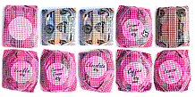
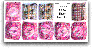
Recently Tim O'Reilly pointed out the nice Ajax interface that Roger's Chocolate employs. While I think it is pretty cool it does exhibit a common anti-pattern.As Tim points out "to build a custom assortment of your favorite flavors, you first place an order for the standard assortment, then click on items to take them out of the box, and choose from a list to put others in."
Once you know that process it is indeed fairly easy to customize a box. The problem, however, is that it is not immediately obvious that is the process. Here is how you remove candy from the box (clicking on the 4th candy on the top row will delete it).
 |  |
Missed Moments -- Not providing feedback throughout an interaction. Missed moments will confuse the user about what to do during an interaction.
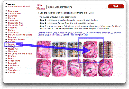
In this example we have two actions we would like to cue the user to do. First, how to remove a piece of candy and second, how to add a new piece of candy in it's place. The current interface tries to do it through help text (a sign that there are no other cues to how to customize your box):

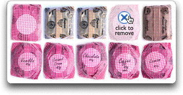
For delete we can provide a type of invitational pattern, the In-context Tool. In-context tools provide actions near the object being hovered over (the focus of the current action). In this example, when the user hovers over a piece of candy we can show a Delete action represented by a delete icon in context. Here is one way this might be represented:
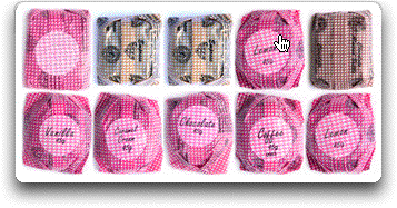
Compared to just the cursor changing:
Here are some things I don't like about this. And some alternate suggestions.
- When you hover over the links they show up in the candy slot but don't stick till you click. Hover actions on links are usually confusing (another anti-pattern, Linkitus)
- Referencing another interface element way to the left in the nav list is problematic due to related elements being so far apart. The rules of proximity argue for it to be close by for the action.
- You could just use drag and drop of the flavors. Ideally it would be the candy items you would drag over into the box. But drag/drop is not highly discoverable.
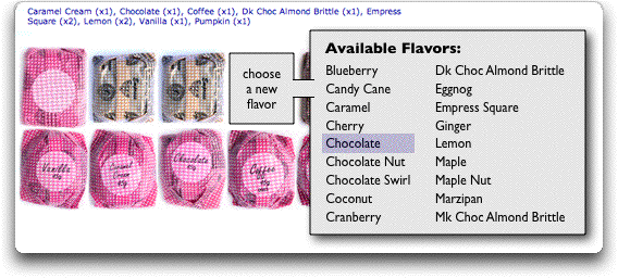
Another approach that pulls proximity, invitations and in-context tools together would be to provide the choice for a new flavor like this:
Other ideas for improvement?
1 comment:
Nice anti-pattern. I have some thoughts on a possible fix.
In all honesty, the whole thing seems a bit too slick for it's own good. The important information of what you want, how many of each flavor, is lost in the display.
There is a hard-to-read list of how many are in each (cherry (x2), maple nut (x2)), etc. There are also names on the wrappers. Those names are very hard to read, and also to have a sense of what is what.
This page would be served much better by having a simple list with counts next to each item, with either an open-text box, or increment/decrement arrows next to each number, along with a total count. It would provide a great reference to change things quickly without being confused.
If the display of the box was important, a smaller version could be used to show open spots and arrangements.
As is, it gets very tricky to use when you do anything beyond the 10 item box.
Bill, I don't know if you noticed, but there are some good anti-patterns in their shopping cart as well. :)
Post a Comment