NOTE: This blog has been moved to http://www.looksgoodworkswell.com

Thursday, November 17, 2005

Visio Wireframe Toolkit for Download

In an earlier post I mentioned a wireframe toolkit I wrote for Visio to make wireframe creation go much faster. Specifically I discussed one aspect of the kit-- animating wireframes with Visio. I wrote a fuller article that is just getting around to being published on boxesandarrows.com. It should show up this weekend.

In the article, I provide a reference to the fuller wireframe toolkit and they (at boxesandarrows) have agreed to host the installation files. Since I have not really explained the wireframe toolkit nor provided a way to download it before, I felt it would be important to provide a blog article about the kit and how to get it for your own use.

Caveats
Please note. The kit was fine-tuned for our frameworks at Sabre (some of which became the openrico.org project). As such the code generation is only beneficial to those with that framework (sorry, not Rico). However, those that are industrious can open up the Visual Basic Editor in Visio and find the code that generates JSP and Java/Swing code and simply replace it with code to generate PHP, ASP or whatever suits your fancy.

Also, the style has been reduced to a mostly color-less variety suitable for wireframes. In the original we had our demo CSS style implemented in Visio. The color-less variety was a really quick hack I did to dumb it down.

I don't have any proper documentation. I have included a movie presentation on how some of the features look when someone is using them.

And finally, I have spent no time in the last 5 or 6 months refining it. Now that I understand how to create Visio shapes and manipulate them I would do some things differently. I keep thinking it would be nice to clean it up, fully document it and release it. That though was what kept me from sharing it before. So, here it is. Hopefully, some will find it helpful.

Wireframe Prototyping for Visio

Visio is widely used by interaction designers and information architects for creating wireframes. At my previous employer, Sabre, I created an extensive wireframe toolkit for Visio that included such features as:

  • Complete web component stencil library (including standard components, table, menus, tabs, and tree)
  • Fast, intelligent snap-to layout using pre-programmed Visio connectors
  • Provide a way to visualize rich interactions (animating a wireframe)
  • Intelligent components that have built-in behaviors
  • Generate requirements documents from wireframe artifacts
  • Generate code from wireframe artifacts
  • Automated annotations and callouts

Download & Installation
The stencil library is available for download.
  1. Make sure you have Microsoft Visio 2003 installed on your machine.
  2. Download the zip file
  3. Unzip this into your C:\My Documents\My Shapes folder. (My Shapes should have been created by Visio when you installed it.) You should have the contents of the zip directly in the My Shapes folder.

Now that it is installed, you can navigate to this directory and double-click inlineEditWireframeExample.vsd to experiment with the photo editing example. If you want to create a new Visio wireframe using the stencil library double-click the Wireframe.vst file.

Notes
  • Make sure you allow macros to run (change your security setting to avoid the annoying messages... sorry I know how to fix this, just haven't gotten around to it.)
  • The templates were originally built for enterprise web applications. Some parts may or may not be applicable to your application. I welcome feedback. At some point I would like to rework to be more generally useful.

Boxes And Arrows Article
Look for upcoming article (11/20/05 ?)

Presentation
Enjoy!

Saturday, November 12, 2005

Y! Trip Planner & Web 2.0 Content Objects

A couple of weeks back, Yahoo! announced Trip Planner

If you haven't had a chance to use it, I strongly encourage you to get your hands on it. In a nutshell, you can plan day trips, weekend trips, vacations into a trip plan. You can build the trip plan collaboratively with a group of fellow travelers or if you are a control-freak, all by yourself ;-)

At a later time I may blog about the details of the interface. Others have gone into lots of detail. And the team has lots of really cool features planned. On top of that, the team is full of talented folks and they are jazzed about this product. I am too.

Trip Planner is a good example of how an older idea can be transformed as it moves to become a Web 2.0 tool.

I used to use Microsoft Trip Planner. However it was limited since the maps and travel guide information were based on a snapshot on my CD. I loved it but it was severely limited in what it could give me as well as rapidly growing out of date.

There are a lot of things I love about this product:
  • Collaborate on trip planning
  • Share trips publicly
  • Pulls trip planning into a single location
  • Can find other's trips
  • Uses the ever expanding Y! Maps products (map view)
  • Has enormous tie in potential to other Y! products (watch for upcoming features!)
  • I just love travel. Hey I live in the Bay Area. Lots of places to explore!
Web 2.0 Content Objects
But I think what has really excited me about this product is how it illustrates the power of Web 2.0 Content Objects.

In Microsoft Trip Planner the trip plan was a file on my disk. I could send the file to a friend and if they had the same application they could access it.

But think of the power of the web as a platform for these Web 2.0 style files. I can create trip planning content, share it publicly, and allow others (of my choosing) to collaborate with me on it. And once good trip plans surface over time, there will be less and less need for me to create trip plans from scratch.

This is what del.icio.us (and later furl.net and myweb2.yahoo.com) did for bookmarks. Shareable and findable.

Microformats
microformats.org is an attempt at defining the underlying data format for sharing user generated content. I don't want to discuss the merits of whether it should be in HTML or XML format. I just find the idea of movie reviews, restaurant reviews, trip plans, news clips, and a host of other content being in a format that is shareable, bloggable, findable to be really exciting.

Challenges for User Experience
So that leaves several challenges for us in the User Experience world. Here are just a couple of issues.
  • Discovering Content Objects. Progressive disclosure (giving the user just the amount of features they need at the beginning and growing with the user) will help. Finding other trip plans while just searching around travel related items lead the user to explore.
  • Getting folks to share. We all have suspicions about sharing information on the web. Do I want people to know where I travel, what I like to do? To some of us it is not an issue. To others that is terrifying. How do we create assurances (and more importantly we had better do the right thing with their data!) that there can be some anonymity? Trip Planner allows you to choose to share or not. But perhaps there should be a way to share anonymously. Have Trip Planner only post the outline of the trip and no user generated comments (only from other sources).
  • Understanding collaboration. At Y! we struggle with who your community is. Is it Y!360, address contacts, IM buddies, flickr friends and family? And do user's really understand how they would work with other people (or how many will do this?)
  • Avoiding feature bloat. We are building full-scale applications. Yet most user's engage us ligthtly. How do you make feature rich, discoverable applications? Providing "feature invitations" unobtrusively at the moment they need it.
  • Getting users to understand how other tools might work together to solve their problem. Trip Planner uses Y! Local, Y! Maps, Y! Travel, Y! Search, Y! Travel Guides. It will use more properties in the future. How do you take a slice like trip planning across all of these products? Obviously you have to treat the other properties like services and build a complete application out of this slice. That leads to understanding how to present robust applications (without undue clutter, etc.) as a web application.
I'm sure there are other issues. As well as other solutions than those I briefly touched on above.

What do you think the challenges are for these types of applications? For these types of shareable content objects? Other examples you have seen?

The Blurry Line
And, one more thing. I notice that Microsoft has Streets & Trips 2006. Looks to be very full featured. It seems to pull its content from the web. This raises a number of questions about what is the right approach. Do I build a product like this as a desktop application or as a web application? Sounds like a good topic for another blog...

Friday, November 11, 2005

Animating Interactions With Photoshop CS2

Sometime in the next month my article for boxesandarrows.com will finally appear. It discusses using Microsoft Visio for animating rich interactions. I discuss this briefly in a prior blog.

Photoshop CS and CS2 introduced some new features that make it easy to simulate complex interactions including animated transitions.

Layered Comps
Photoshop CS brought us the wonderful world of layered comps. You can now name the layer configuration. The layer order, visibility, layer styles, and element positions are saved.

It is sort of like being able to take a photo snapshot of the current state of the design.

Its purpose is to create alternate designs and give them a name. Then the designer can walk through the different comp designs with a customer to choose the best one among them.

In the world of rich interactions, we can take a snapshot of the user interface at each interesting event state or user interaction.

Animation Palette
Photoshop CS2 brought an animation palette. By adding layered comps to the each frame of an animation, you can play the various layered comps. Think of it being able to play back a set of complex interactions.

A cool feature is the ability to create tweening between frames.

An example is I could have two rectangles positioned and named as a layered comp called rectangles. The next comp could switch these rectangles. This could be called swapped_rectangles. Dragging these two layered comps into the animation palette will create two steps to the animation: rectangles in their original position and rectangles in their final position. Not too exciting, right? Now select both frames in the animation palette and tell it to tween and allow it to create 10 frames. Now we have 12 frames total.

When you run the animation, notice that the rectangles look like they are swapping. The in-between frames make the animation look convincing.

Capture the Movie
Simplest way is to use a video capture tool (like SnapZ Pro for the Mac) to create a movie file of the interaction as it is played in Photoshop. The movie can be distributed to illustrate the interaction.

The combination of layered comps, animation, and video capture create a simple way to illustrate cinematic effects and complex interactions in a page.

Interaction Matrix

Recently, I have been exploring drag and drop and inline editing for the web.

At Yahoo! I am fortunate to work with some incredibly bright folks. We get together for brainstorming sessions to discuss interactions like these that have application all across the Yahoo! network.

When I started capturing our sessions and writing up documents for these two interactions, I was really struck with how non-trivial it was to define exactly how a drag and drop or inline edit would operate in every case.

Let me take drag and drop to illustrate my point.

With drag & drop there are at least ten interesting event states.
  • Page load
  • Mouse hover
  • Mouse down
  • Drag initiated
  • Drag over valid target
  • Drag over invalid target
  • Drag over parent container
  • Drop accepted
  • Drop rejected
  • Drop on parent container
And there are a number of elements that get involved in the interaction sequences. Let's call them our interaction actors. I count at least seven of them.
  • Page
  • Cursor
  • Tool Tip
  • Drag Object
  • Drag Object's Proxy (ghost of object being dragged)
  • Drag Object's Parent Container
  • Drop Target
That means that there are 70 possible visual states or transitions in a single drag and drop sequence. If you eliminate ones that don't make sense (e.g., tooltip on mousedown) you end up with about 40 possible states.

So defining this in a meeting is non-trivial.

To simplify this, I created the concept of an Interaction Storyboard Matrix. For simplicity I created it as a Microsoft Excel document. Each row corresponds to an actor; each column corresponds to an event state. Each cell in the grid represents a different visual state or animation providing feedback or affordances during the interaction.

Here is what the drag and drop interaction storyboard matrix looks like:

dnd-storyboard.png
Events and Actors Reveal Interaction Storyboard Frames

So how do you use it?

Just fill in the non-gray cells with how each actor will look or behave during each event state. The interaction storyboard matrix is just a way to show different visual channels against the backdrop of event interactions. Think of it as a choreographed dance and each state being a difference scene in the play.

Feel free to download both the drag and drop template and the inline editing template.

Let me know if you find this useful.

Special thanks go to my fellow Yahoos. Matt Leacock, Kiersten Lammerding, Lance Nishihira, Eric Miraglia, Rob Aseron, Kathleen Watkins, Eric Costello, Anja Krombholz, Ericson DeJesus, Greg Rosenberg and many others...

Popups With a Twist

If you lived through the desktop UI boom of the 80's and 90's, you will recall the history of popup windows. You will recall the rise and fall of their popularity. And now with the web we are seeing popups growing in popularity. Are we headed for the same problem? Or are these popups different? While I believe that once can create annoying popups, what we are starting to see on the web are popups with a slightly new twist.

popup-localmaps-restaurant.png
Example of a Lightweight Popup from Yahoo! Local

So here is where I want to say (with a nice, slow, southern, raspy drawl), "Back in my day, we didn't have no popups."

But in reality we did. With the advent of windowing we kind of went popup crazy. We had moved from a world of ASCII terminal based applications that went from screen to screen (or if you were clever you could tile in an area of the screen using some IBM font characters to draw the popup border and create a simulated dialog) to a nice environment with menus, windows, mice, and icons. With that sudden power applications started adding popups everywhere.

In Alan Cooper's original About Face book, he used the term, Idiot Boxes, for unnecessary dialogs that interrupt the user's flow asking pointless confirmation questions or asking for information that they system should already have.

One key design goal that I have always strived for is to minimize modes, context switches and windows for the user to manage. Direct manipulation helps to realize this goal. But another technique is to avoid going to other screens or pages to get information from the user.

In the web world, for the longest, we were plagued with two types of popups:
  • Javascript alert box. Your basic ugly dialog box
  • Javascript open window. Which created another browser window (that you could leave fairly undecorated)
Later, two varieties of popups came on the scene
  • DIV based lightweight layers
  • iframe based layer
iframes provided some advantages and disadvantages. With iframes you can specify a separate HTTP connection and an iframe can cover native browser components (e.g., in IE/Win the combo box shows above any DIV layer and while you can mess with z-ordering to resolve it, other issues are introduced.) The problem with iframes is that they can be slow. The HTTP request and render cycle can cause a second or more delay to populate an iframe's content.

The use of a DIV that is absolute positioned and given a higher z-order index, styled with a title and perhaps made draggable has come into vogue of late.

And for good reasons.
  • They allow the user to input more information without leaving the current page context
  • They allow the user to look at more information without leaving the current page context
Notice the interesting twist.

On desktop apps, dialogs seem to be disruptive. In web apps, popups (when done correctly) can actually minimize the need for breaking the user's concentration by bringing in information in context quickly and easily. (Obviously abuse will not be far behind.)

In my previous post I illustrated the Hover Detail. Luke Wroblenski commented about using Hover Detail + In Context Tools to make more complex related commands readily available to the user without disrupting flow.

This is really intriguing! These really are not your father's popups!

Its the same basic idea. Just popups. But with a light twist. So what is this light twist that makes these web popups so much better than the old style? Here are some of the things that I think make them better.
  • Their goal is to minimize disruption to the user
  • They are virtually instantaneous. No waiting like in the old days.
  • They can be styled to feel lightweight
  • They can be styled to match the page they are part of (this makes them feel like they are part of the page, but yet not at the same time)
  • They have enough familarity with normal popups that users know how to move and close them (hopefully!)
  • They are often triggered with just a mouse hover and dismissed with a mouse out
  • They remove the fear of where a link might lead me.
  • They remove the need to load a new page
  • They often bring information at the point of interaction and at the point of curiousity
  • They remove the need for getting back to the context by using a back button
  • They provide information in context-- a powerful information architecture principle.
  • Couple with Ajax, they provide a world of information at the user's fingertip (or mouse point ;-)
  • And they just feel great! No, seriously, after living in the land of page to page navigation it is refreshing to be able to pull content in quickly.
Several nice examples are in order.

Yahoo! Instant Search
popup-yahoo-instantsearch.png
Yahoo! Instant Search Uses a Lightweight Balloon Approach to Show Shortcut Matches

Netflix
hover-netflix-detail.png
Netflix Movie Details

MarketWatch
popup-marketwatch.png
Lightweight, Quick but Substantive. From MarketWatch. Illustrates Information & Commands in a Single In Context Popup

Thursday, November 10, 2005

Musings on Mouse Hover

I've been thinking a lot lately about mouse hovers. Yeh, I know I really should get out more often ;-)

A mouse hover is a really simple event. When you get a mouseover event you do someting. When you get a mouseout event you usually restore things to the original state.

Mouse hovers were virtually unheard of in the desktop user interface world. I remember writing some very sophisticated applications (games, graphical drawing packages, etc.) and only using mouse hover for some very basic operations. Tooltips & mouse coordinate feedback are two that come to mind.

It was a while before rollovers showed up. In the original Macintosh Finder and in Windows 3.1, rollovers were not used to indicate an object was actionable. It was the advent of the web and the need for discoverability that really opened the door for the lowly hover to be come to the forefront.

In the desktop world, hovers were not that immediately useful. It seemed gratuitous and redundant in those early days to do something on a mouse hover. Traditional desktop apps have always been structured around user interface controls providing the structure with data poured into this mold. Web sites & applications started with content. With hyperlinks and images embedded in the page, it was not obvious what the 'control' or navigation structure of the page was without some visual clues. Over time rollover effects that made it into the web found themselves migrating to the desktop.

Windows 95 flattened toolbars to remove the visual speed bumbs created by beveled button borders. In its place, the mouse hover showed the border and gave the essential clue that the object was clickable. As more and more folks have got used to exploring with a mouse hover, it became a more acceptable a way to discover functionality.

Ajax, DHTML and the Lowly Hover
Now that interactions are even more dense, the hover has become our friend to discoverability. We are introducing new idioms to the web space. Things like drag and drop and inline editability are not immediately expected. The hover can provide vital clues to the behavior of an application at the moment the user is curious about it. Hovers are also the lightest event for the user (they just move the mouse.)

Let's look at some places that hover is showing up more and more (not an exhaustive list!)

Hover Invitation
We can use the hover to cue the user what is going to happen next.

Inline editing
How would you know that parts of a web page's content is editable? We could be overt and just say it on the page. But that gets busy if there are lots of places that are editable. We could make everything look editable. But that also makes for a cluttered page. Hover lets us do just-in-time functionality feedback.

In flickr, hover over the photo title and you will see the color change to indicate the area has some interaction to offer. Coupled with the tooltip the user is invited to click to edit the title.

hover-flickr-1.png
Flickr's Photo Title Before Hover

hover-flickr-2.png
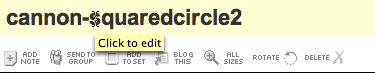
Flickr's Photo Title After Hover

Pretty obvious if the user ever hovers over the title.

In backpackit.com, the 37 Signals folks take a similar approach. They shad the area editable with a gradiated yellow background and add a lightweight inline, incontext toolset. It becomes obvious that you can edit, delete (trash can not shown below), etc. the content.

hover-backpackit-1.png
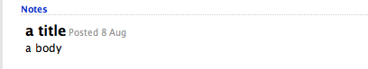
Backpackit Note - Non Editable

hover-backpackit-2.png
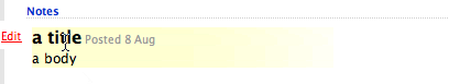
Backpackit Note - Showing Editability

In Yahoo's trip planner (travel.yahoo.com/trip) you get the same style of in-context toolsets on hover.

hover-trip-tools-1.png
Y! Travel's Trip Planner - Itinerary Item

hover-trip-tools-2.png
Y! Travel's Trip Planner - Showing Editability

Ratings
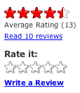
Yahoo popularized ratings. Just check out how the hover helps guide a user to rate a movie.

hover-movies-invitation-1.png
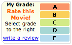
Yahoo! Movies Ratings - Not Rated

hover-movies-invitation-2.png
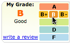
Yahoo! Movies Ratings - Invitation to Rate

By visually engaging the user in rating possibilities the user only needs to click to participate. This lightweight approach to engagement is the advantage the hover has. Hover requires little effort. The next step is just to click.

Hover is nice because it allows you to hide lots of controls and show them only as needed. Showing them in a light enough manner makes it much more engaging to participate.

One more example will suffice from Yahoo! Local's Reviews.

hover-local-reviews-1.png
Yahoo! Local Review Rating - Before Hover

hover-local-reviews-2.png
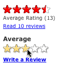
Yahoo! Local Review Rating - During Hover

Flagging Mail
In the new Y! Mail, hovering over a message's column for flagging shows a lightly shaded flag. Clicking turns the flag on.

hover-mail-flagging-1.png
Yahoo! Mail (Beta) - Unflagged Mail

hover-mail-flagging-2.png
Yahoo! Mail (Beta) - Inviting to Flag

I think gmail's star could have been greatly improved with the addition of a hover. Although I don't believe that Google believes in the hover event at this point in time ;-)

hover-gmail-star.png
Gmail's Star - No Hover

In all of these the hover creates an invitation, a call to action. It shows what the user can do right now, right where they are at.

I call this the Hover Invitation.

Hover Zoom/Focus
There is another use for hover. Since the mouse can indicate where I want to look, the hover can say, hey I want to focus here... I want more detail.

Getting More Detail
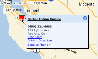
local.yahoo.com does this with the map. Try searching for 'restaurants' in some locale and you will see a map to the left. Hovering over the map enlarges it. Leaving the map area shrinks it back to the normal size.

hover-local-map-1.png
Yahoo! Local Map Inset - Before Hover
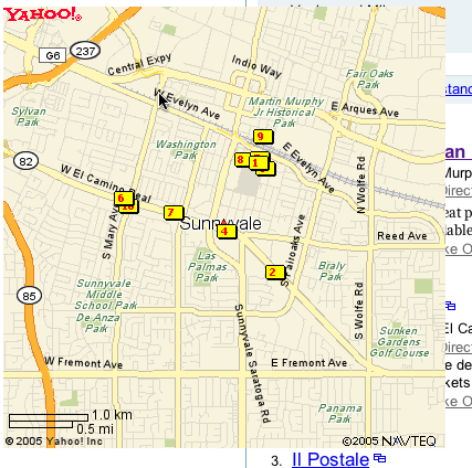
hover-local-map-2.png
Yahoo! Local Map Zoomed - After Hover


This pattern is about Mouse Focus or Mouse Zoom. In this case the hover is the interaction. While it might lead to more interactions, the Hover Invitation is a specific call to action, an invitation to click.

However, there are problems with this approach. Once the area is zoomed up it can cover other important areas, controls on the page. The user also has to move a lot further to exit the now enlarged area to get it to shrink down in size. You have to be certain that the user really wants to interact with an object to zoom on hover.

This is also common with photo organizing software. Hovering over a photo automatically enlarges it slightly.

A very slight variation on this is enlarging an area on hover to make it more apparent it will be the object selected. The Macintosh OS X Dock does this. Although with mixed results. Part of the problem is the area is just magnified. If the icon is 32x32 and it enlarges to 64x64, you still only have 32 pixels of mouse movement to traverse the object. This causes people to zoom past tools by accident.

Hover Detail
And yet another variation is the hover detail. By hovering over something I get a separate view that shows up in a lightweight popup allowing me to see or read more data about an entity. Not too much unlike a the hover zoom, but with more emphasis on letting me peek at more information without changing the page at all.

You can see an example of this in netflix.com.

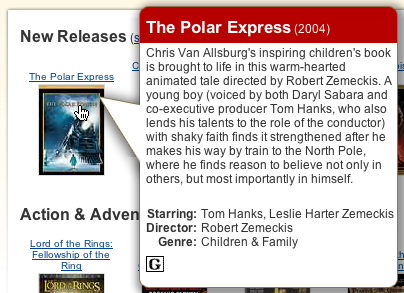
Netflix Hover Detail

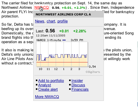
Also, it is used to get more of the story in news.yahoo.com.

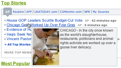
Yahoo! News Hover Detail

Going Forward
Of course, hover will be abused. Once could imagine a page with no controls showing and they only show their action on hover. This is the idea of mystery meat interaction a wonderfully hideous approach to engagement.

But used wisely, the hover can
  • Engage the user at the point of interest
  • Reduce clutter on the page
  • Give specific previews as to what will happen if the user clicks
  • Provide a lighter way to zoom in on things with little effort
Take-Away
Use hover to create a more lightweight but engaging way to cue the user to hidden functionality. Use it as a way to provide just-in-time details. Use it to keep your page visually simpler providing what is needed when they are most curious.